Sunday, 22 May 2011

Massive update

…and the world didn’t end yesterday as some people were predicting – I’m quite relieved! But, I cannot believe that it is over a month since I wrote anything here – time for some serious catching up!

Yesterday I did something different and fun, I designed my own cover for the August edition of Wallpaper* magazine. There is a limited palette of shapes/photos/patterns/text that you put together, in layers, to create your own personalized cover and then in August you receive your copy of Wallpaper* with your own front cover and slightly personalized back cover too. I had hoped to have the option of uploading one of my own designs which would have been really exciting, but that wasn’t possible, so this is what I came up with…


…can’t wait for it to pop through the letter box!

Anyway, since the last time I wrote anything here I have been busy thinking about the chair and what exactly I plan to do with it, I have been doing some screen printing in the Print Workshop at uni, I have been thinking about reviving and improving a project that I worked on as an undergraduate, contemplating the development of Whimsy & Quirk’s website, I have bought a graphics tablet and have generally been planning how and what I want to show at the end of year Design Show.

The Chair
I am definitely planning to hand print some fabric for the seat cushion, so I now know that I need to redraw my circles pattern so that it can be cut into a stencil (I want to convert it into stencils anyway because part of my business plan is to design and sell stencils). But before I do any of that I need to decide upon a definitive colour scheme so that I can create a whole range of items with a cohesive colour theme.

I started by drawing the chair and then colouring the image using, as inspiration, the Trend Bible colour predictions, and then trying to ‘match’ those colours to the range of spray paints Painter’s Touch by Rust-Oleum (www.imaginespraycreate.com).  I plan to use spray paint in the hope that it won’t clog up the weave of the chair.


My main issue with all this is that I’m still not happy about any of the predicted trends, so it then became necessary to think about my own trend, not a prediction but my range of spring/summer 2012 colours, these are colours that I am happy with, they work well together and will also work happily with a range of products. These colours are chosen as my spring/summer 2012 colour palette because the colours are based upon a Mediterranean summer, redolent of the scent of lavender and filled with the buzzing of bees…


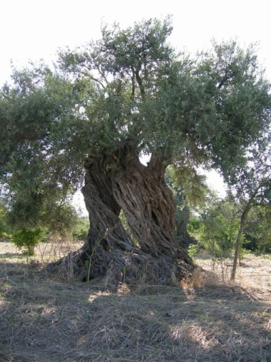
The sources of the images are -
1. http://images.mooseyscountrygarden.com/moosey-garden-forums/l/lavender_bumblebee2_164.jpg
2. http://www.johnnyjet.com/image/PicForNewsletterClubMedOpioJune2007LavenderPostcard.JPG
3. http://www.discoverlavender.com/Lavender-Farm-5.jpg
4. http://www.wayfaring.info/wp-content/uploads/2009/07/provence-countryside-lavender.jpg
5. and 6. My own photos
7. http://www.smppa.org.uk/Natural_History/Birds/Images/Large/kingfisher-a-07.10.04_bf.jpg
8. http://i.dailymail.co.uk/i/pix/2008/07/01/article-0-01CE754100000578-956_468x628.jpg
9. http://www.francemonthly.com/n/0902/images/olive-tree.jpg
These websites were consulted on 9/5/11

Based upon the colours that I have selected (above) from my ‘Mood Board’ I have put together this little image to show how the colours will work together throughout the rest of this module.


So, at this point I have decided that I will spray paint the body of the chair in almond, which will work well with my colour palette…


…which now means that I need to get on and paint the chair. But there are plenty of other jobs that I need to get on with too.

Print Workshop
I had a great afternoon in the Print Workshop, I took along two differently scaled versions of the circle pattern to print, but I didn’t get to print both – I started with the larger scaled image and found that some of the circles with the lighter weighted lines weren’t printing properly, so obviously the smaller scaled image would have been even less likely to print as desired. So, next time I go in I will have the images drawn in heavier lines.

Sweetie Lamp
This is a module that I worked on during my first year as an undergraduate. The module was about re-using and recycling instead of throwing away, so we had to make something using recycled materials or rubbish.

My lamp was made of mdf circles which my husband collected as waste from his place of work and were painted using left over household emulsion, an old lampshade (the frame of which was expanded in the university workshop), old string and buttons, a damaged roll of greaseproof paper, Quality Street wrappers. I named it the Sweetie Lamp because the base reminded me of sweetie necklaces that I had as a child, probably due to the colours.


In theory the base can be created in the same way as last time, but using my current colours. But, this time I will use a real lampshade frame and cover it in fabric, hand-printed with the circle pattern.


I feel that the revamped Sweetie Lamp will look fantastic at the show, where it will be sat with the chair and wallpapers all working together with their colour theme – I’m really looking forward to seeing it.

Whimsy & Quirk’s website
I have already started on the website, but I am looking at/researching each stage as I go along. I have bought my website from Mr Site (http://www.mrsite.co.uk), I am using the Takeaway edition which has e-commerce facilities, and have already set up the basics. The website address is www.whimsyandquirk.co.uk and my email address is nicky@whimsyandquirk.co.uk, although the website is currently under construction.

Obviously there are some basic design decisions to be made right from the start, so I have been looking at other websites and have come to the conclusion that design websites seem to appear at their best with a white background and simple black or grey text – I think that this is because it allows the imagery to work for itself rather than competing with a busy or colourful background or even a flowing or over decorative font.

This is as far as I have got with the website, it will take some time because I have no previous experience of setting up a website and it is all a massive learning curve. My next decisions will be how many pages the website should have and do I need any widgets!?

Graphics Tablet
I need to re-draw my circle pattern so that it can be cut into stencils, so I thought that a Graphics Tablet may speed the re-drawing up by making it more straightforward – it must be easier to draw with a pen than a mouse – the graphics tablet plugs into a USB socket in the pc and works as an input device, but you use a special pen and draw onto the tablet… simple! I will have to be trying this out during the next week.

The Design Show
For the design show I am picturing (in my mind’s eye at the moment) two upright panels, possible 2.5 metres high, stood at a right angle and joined at the angle, with wallpapers coming over the top of the panels and pooling into rolls on the floor. There will be both hand-printed and digitally printed wallpapers, in the clematis and circles design, all using the same colour palette but with variations. The sweetie lamp will be in the corner where the two panels meet and the chair will be stood next to the lamp. I am hoping to find another chair so I can have one seat cushion with the circles pattern and one with the clematis pattern, but I am having difficulty getting one at the moment. I will try to find the time to draw this during the week, because we will soon come to the point where Michael will be trying to work out how much space everybody will need for the show.

This means that there is lots of work for me to be getting on with, and really I didn’t have any spare time for designing my front cover for Wallpaper* magazine, but I did enjoy it!

Tuesday, 19 April 2011

Whimsy & Quirk's new logo

Well it’s definitely a long time since I last wrote anything here… but here I am again. I am now fully recovered and have gone back to work; yesterday I went back in to Uni for the first time, since my operation, for a tutorial with Michael.

We are now nearly half way through the Realisation module, which is rather alarming, and will soon need to be putting together an interim presentation of what I have covered and achieved so far, so this seems to be an ideal point at which to sort my thoughts out and organise everything.
I have continued working with the circles, but at the same time I have been working on my company logo. There is a requirement for me to have a portfolio before the end of this module and ideally all the images in my portfolio should have the Whimsy & Quirk logo in a corner. This being the case, perhaps I should start by telling you about my logo design.

Originally I had been thinking of designing circles as part of the logo design but they developed into something bigger, but the designs filling the circles would work just as well filling a letter as a circle, so that was my starting point. I wanted to use text the represented the two individual words ‘Whimsy’ and ‘Quirk’ and originally I planned to use writing samples of two good friends – I felt that it would add to the quirkiness if it almost looked hand written – so I asked my friend Nina to write ‘Whimsy’ because her writing has a very pleasant dreamy and whimsical quality to it…


Tim wrote ‘Quirky’ because I feel that his writing is a quirky mix of Arty, curly and also strong and confident…


I thought that these very different writing styles would represent Whimsy & Quirk perfectly. I scanned the words into my laptop and opened them in Illustrator and then drew around them, but when it came to form a ‘clipping mask’ which should cut the shape out of a pattern it would not work. I spent 4 days trying to make it work, getting more and more frustrated on each day until… I gave up! My next best option was to download suitable fonts, to which end I went on http://www.ultimatefontdownload.com (consulted on 26/3/11), paid $19.99, which was approximately £13 and downloaded 10,000 that are licensed for commercial use – perfect. The combination of letters, that I chose to form the logo, look like this…

 Whimsy & Quirk

Whimsy is made up of W in Delta Hey Max Nine font, HM and Y are written in Penshurst font - bold, I used the Casua font and S has been written in Birmingham font.

Quirk has been created by using the Q of Quigley Wiggly font, because it reminds me of Tim’s Q, the U and R are made up of You are what you eat font and the I and K have been written in Cream and sugar font.

After having decided upon how the logo should be written I then had to decide upon the pattern designs that would be behind the letters. I managed to incorporate an ‘Op Art’ design, my clematis design from the Experimentation and Feasibility module, some cherry blossom that I took at photo of, a touch of Art Deco inspiration and also some traditional basket weave – the final result looks like this…


I am pleased with my final logo design. It has gone through several stages, including one that had very wild colours and may have alienated half my potential clients before they had looked at my work!

Whilst I sort out my mind and what I need to do and in what order I am also preparing to go on a print workshop, so I need to work out a design that can translate into a screen print to be printed onto fabric – potentially for the Lloyd Loom seat cover – so I need to do some serious thinking about what I wish to achieve. This is my most urgent job on the ‘to do’ list. So I will get on with that and then tell you some more of my plans. In the meantime I would be interested to hear any comments you have to make about my new logo design.

Tuesday, 8 March 2011

What's new with Circles!

I’m feeling much than the last time I wrote! Although I’m still not permitted to lift or stretch, or drive, and I’m still off work.

I have been busily working on my circles, converting some of them into Illustrator images, testing how they would look in wallpaper designs, exploring scale and colour. I am not totally happy with the colourways that I have tried so far, but I will keep working with that issue. The colourways that I have been using up until now were all obtained from Trend Bible (http://www.trendbible.co.uk/blog/home-trends/home-trends-autumnwinter-201112-preview consulted 6/3/11). I have been working with their colour predictions for Autumn/Winter 2011-12. Trend Bible are an extremely clever company who attend trade shows etc and then put together trend predictions for their customers and the most amazing bi-annual trend books which are aesthetically inspired and inspirational. The University has some of these trend books in the library, but they do not have the most recent editions, which is very disappointing.


This is just one of the trend predictions from Trend Bible. It is beautifully put together and the imagery is imaginative and inspires me to create.
Anyway, here is a small selection of the work that I have achieved recently…


The single repeat is in the ‘Alpine Shelter’ colours from Trend Bible and the colours used in the room above are from their ‘Geographique’ trend. The ‘Geographique’ colours are possibly the best colours, from my perspective, because they are warm, vibrant and feel alive – so I need to try amending the way I have put them together. I am very pleased with the slightly oriental look that my pattern has though, this is mainly due to the 'Spirograph' style flowers which look similar to Japanese chrysanthemums.

I will continue designing circles, but within theme ranges, converting them into Illustrator images, exploring different ways of laying them out into patterns… and also how to convert them into stencils, because that is a direction that Whimsy & Quirk may potentially move toward.

Thursday, 24 February 2011

First decision made for Realisation

So, here I am, a week after my operation. I have not managed much in the way of work for the Realisation module during this last week, for obvious reasons, and still at this point I am very uncomfortable and can’t stay focussed on anything for very long (or sat in one position either!). Hernia repairs are not fun.

Anyway, whinge over, I have been thinking about what I would like to achieve, and have in place, by the end of this module. One of the things that I would like to incorporate into the remit of Whimsy & Quirk is to take pieces of vintage furniture and ‘tart’ them up, starting with the old Lloyd Loom chair that I have upstairs. The thought process is to paint the basic structure, recover the seat cushion in a textile designed and printed by me, and then add a cushion that works with the overall style of the colours and patterns used on the chair. I hope to obtain further supplies of chairs of this nature from Darwin’s Sales Rooms in Bedale, they specialise in auctions of house clearance furniture and knick knacks. It would be fantastic if I could have a range of different chairs – maybe designed specifically for bedrooms? – all brought back to life, in different colour schemes and pattern styles, ready for the show in September.

According to Lloyd Loom’s website (http://www.lloydloom.com/home  consulted on 24/2/11) ‘Genuine British Lloyd Loom furniture is manufactured from woven twisted paper on a solid beech-wood frame.
Each piece – whether for conservatory, kitchen or restaurant – is individually handmade by craftsmen to your specification and can be in any colour you like.
Our furniture is tremendously strong and, unlike the cane and rattan furniture which inspired the original elegant designs, it will last a generation.’


The chair that I have, upstairs, is at least 40 years old, and may be older because it has brass caps on its feet. It truly deserves a facelift.

Monday, 14 February 2011

Lack of Focus!

Well, I think maybe I’m a little pre-occupied by my impending stay in hospital, because I am having great difficulty staying focused on anything at the moment.

Tomorrow I am meeting Michael so that he can brief me on the Realisation module, so I really wish I was in a more positive place and therefore able to tell Michael what I plan to achieve during the module – but I’m not. Whilst I’m in university tomorrow I plan to take a piece of acoustic foam with me and visit Julian in the workshops – I’m hoping that Julian will have the time to use the laser cutting machine on the acoustic foam to find out how well it cuts. The ease with which the foam cuts may help me to decide upon a direction for this module, although I still haven’t tried dyeing the foam!

Having done so much research into acoustics it would be very satisfying to do something with the information I’ve gathered during the Realisation module, but not if the final product has no aesthetic value because, after all, I wish to design surface patterns rather than purely functional objects.

I have looked in to coloured acoustic foam and it only appears to be coloured as part of a finished object e.g. a tile, rather than sheets of the material to be bought and worked with. But, at the same time, the fact that manufacturers produce an end product made of coloured acoustic foam implies that there is a method of colouring it.

http://kestrel-acoustics.com/acousticfoam.htm consulted on 7/2/11

In the meantime I have been working on images that could be used in the logo design for Whimsy & Quirk. I thought it might be interesting to have a few alternative designs rather than only one… but I haven’t made a final decision yet. As a starting place I have been using a circle as a template and just filling the space with different finishes and images. I have found this very therapeutic and have filled several circles, I have even been playing with overlaying one with another…


Some of the images work better than others but it may be possible to develop some of them into wallpaper/stencil/cushion cover designs too. I will be continuing with this whilst I’m ‘temporarily out of action’!

Tuesday, 1 February 2011

Hmmmmm!

We haven’t been briefed for the Realisation module, but I have decided to start thinking about what I hope and plan to achieve during the module. 

To begin this process I have been having a brain dump! I am a little confused because I have been researching and thinking about acoustics during my Creative Interaction module and I am unsure as to whether I wish to continue with that or return to my hand-printed wallpapers.

So, brain dump…

1.    Logo Design.
I wish to design a logo for Whimsy & Quirk (http://whimsyandquirk.blogspot.com/). The logo I have been using was just a temporary design and now it is time to give serious consideration to a definitive logo. This must be achieved in preparation for business cards etc are dealt with.

2.    Acoustic absorbers.
I need to establish answers to some questions in order to make decisions upon whether to move forward with this. a) is it possible to obtain acoustic foam in a variety of colours or only grey? b) is it possible to dye acoustic foam? I will have to attempt this if there are no other colours apart from grey. Further to these questions, and if I am continuing with this topic, I need to 1) find images of acoustically designed restaurants 2) reflect upon styles of interior and how to approach a combination of acoustics and spatial design for different restaurant styles 3) think about sharper and more contemporary patterns/images for use in the design of restaurant interiors – flowers aren’t always appropriate!

3.    Research up-cycling and recycling.
Another consideration for the Realisation modules is stencilling my own upholstery fabrics, making some 3d appliqué cushion covers and ‘tarting up’ old furniture. I have an old Lloyd Loom chair that I could start with.

4.    Manufacture of frames.
As part of my exercise in considering my options I am also considering making canvases based upon hand stencilled fabrics and 3-d appliqué, but for this I have to be able to obtain frames…or do I want to make them sound absorbers?

Further to these questions and considerations that I also need to give attention to such as 1) if I make canvases would it be worth putting a layer of acoustic wadding behind the fabric to absorb surplus sound? In what depth sizes is it available? 2) which textiles will work well with making canvas art? And which will paint well? hessian? wool felt? canvas? calico? I may need to do more experimentation. 3) what are the best fabric paints to use? in what size containers are they available? What are the different fixing methods available?

So, what am I doing for Realisation? Am I still doing hand-printed wallpapers? appliqué? furniture? canvases? or acoustics? I need to decide and then get on with it, as a matter of some urgency!!!!!!

Tuesday, 25 January 2011

Phew!

Well, that is the Creative Interaction module finished...just have to wait for my grade now! Fingers crossed. I'm feeling totally exhausted, I think the adrenaline rush, caused by finishing everything off and presenting my work today, has faded and I think that it will be an early night tonight. 

I almost had a total disaster though, I hadn't noticed that we also had to submit a 500 word reflective report about what we felt that we had learnt from teamworking - so I had to write one in an hour - no pressure at all!!! Anyway, it's all done, and hopefully I was sufficiently reflective.

So now I have a little break before starting the Realisation module, although I will start making notes and preparing. I'm going to be having an operation next month and may get behind whilst I'm recuperating, so it will help to be a little bit ahead to start with. I think I will begin by looking at a logo design for Whimsy & Quirk.

Anyway, my bed is calling to me so I will say 'Goodnight, sleep tight'